Thinkful

After working with a slew of freelance designers while getting WeVue off the ground, I knew that to become a stronger Product manager, I needed to put aside some time and dive into UI work. But where to begin? There are so many online courses, and I do well with a bit of guidance. After evaluating many of the online options, I realized I needed a mentor, and Thinkful offered a course where I’d have the chance to meet with an experienced designer 1-1 every week via skype.
Through that course, I honed my skills with photoshop, illustrator, and sketch, teaching myself prototyping tools like invision along the way, and diving into the subtle art of branding. Toward the end of the work, I was working exclusively on projects for WeVue. My mentor Tom P was intrigued by what we were doing. To increase the value of working with him, I opted to take the UX course, and he and I set out on a redesign of certain features of the app as part of my course work.
When that course ended, Tom was so intrigued by what we were designing that he came on as our UI/UX designer, and we continued to work together for a year. Below is some of the work I did as part of the course and some things we came up with together. Our work culminated in a Barcamp presentation where Tom skyped in from Spain We used a mobile prototype instead of a deck to tell the audience about how we designed remotely together.
Culture Branding
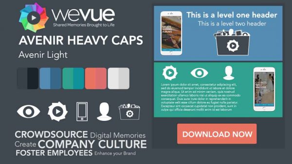
I started off by toying with our branding. Here’s some of what I came up with.
Craigslist Redesign
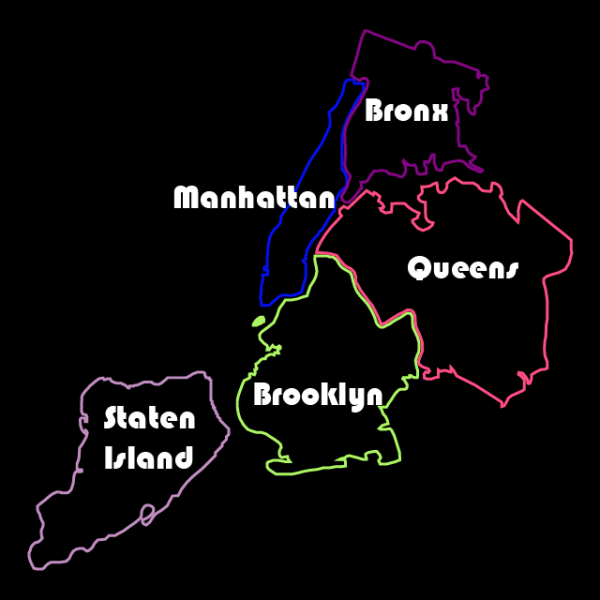
You can read more about this here.
The CultureStream
Tom and I worked on a way for users of the WeVue app to share content about their organizational culture outside of the mobile version of the product onto a culture page to be used for recruiting. Employees would share stories about who they are, what they’re working on, what’s happening at the company, and our platform could pipe that directly to any corporate recruiting page.
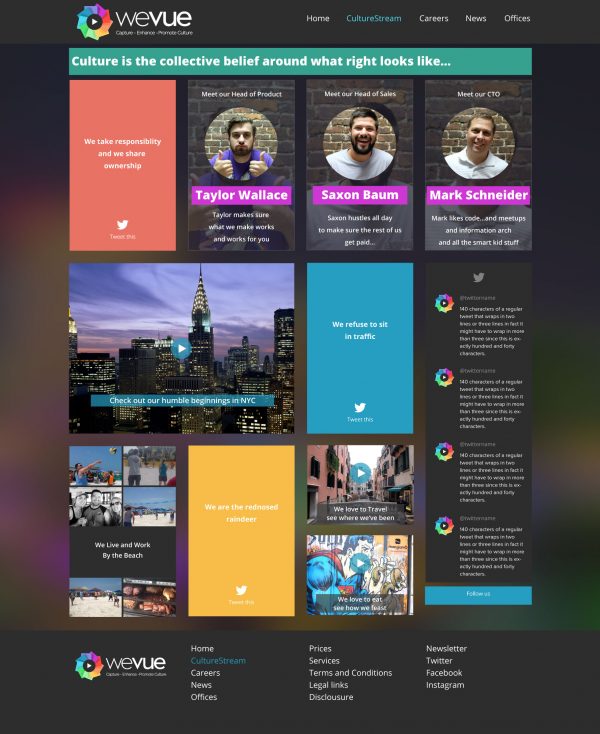
Process Flows and the Culture Machine
Through studying UX, I was able to apply that theory towards my account management design and come up with a system that would essentially automate culture for organizations. The objective was to have our platform schedule certain types of content to be posted automatically, engaging employees without HR or a Culture team needed to do much of anything other than buy our product.
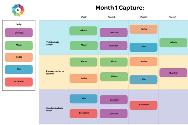
Enterprise Landing Page 1.0
As we pivoted into the enterprise, it became essential to update our branding and our landing page. We designed the site below as our 1.0. You can see how the branding and the site have evolved at www.wevue.com

Full App Redesign
Finally, we worked to redesign every element of our consumer product into a stunning and usable enterprise tool. We wanted to bring an element of fun to the UI that is uncommon in enterprise apps while still creating something functional and usable.

Here’s Tom and I
