WeVue

For the last five years, I’ve been the cofounder and CEO, sourcing and leading a team of designers, developers, marketers, and sales people to develop, market, and sell various iterations of a mobile photo and video sharing platform. WeVue began as a consumer mobile app to gather content from private and public events where you could easily recap that experience by creating crowdsourced videos. The software evolved into an enterprise platform to capture, promote, and engage teams around corporate culture utilizing photo and video sharing. I’ve outlined the evolution of the product to provide a glimpse into the breadth of my experience.
Check out WeVue.com
Check out the WeVue iOS App
Check out the WeVue Android App
Here’s an overview video I created with an illustrator describing what the product looks like today.
Here’s the most recent sales deck I designed providing you with a deeper look into the product marketing strategy.
Our Beginnings
Project: WeVue Consumer Crowdsourcing App
Target User: Event goers
Goal: We tried to create a viral app that connected people not around their social connections, but around photos and videos shared during events. We first created a shared album app and then built a video editor into the product so that users could take shared content and create viral recaps from events.
Role: UX Design and Product Management

WeVue 1.0
We initially partnered with Haneke Design to build our first prototype. We developed the backend in house using Ruby on Rails, and after launching our first version of the app we brought native iOS development in house. I oversaw all elements of the design and development, from branding, UX design, to writing specs for the entire product and working with developers to stay on time and budget.
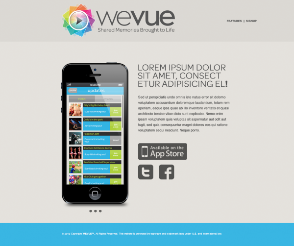
Users could create shared albums from private or public events, invite their friends to collaborate and share photos and videos to those albums, and then anyone with access to an album could create a video recap from that album.
WeVue 2.0
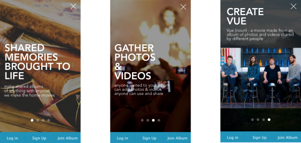
After initially launching and testing our 1.0 product in the consumer market, we discovered inherent flaws with the way users could invite others to the app, share content externally, and generally navigate the feed of events. We likewise launched at the tail end of iOS 6 as Apple dramatically updated their design standard from skeuomorphic toward a more flat design pattern. As such, we worked through a dramatic UI and UX overhaul based on intense user feedback.
After 3 full product lifecycles and two years developing, testing, and marketing to various personas within the event space, we were seeing traction with corporate events. HR and internal communications were using our platform for all hands meetings and corporate offsites. They liked having a mobile app to visualize their culture, and we decided to go all in on selling a product marketed directly at enterprise culture.
The Pivot to the Enterprise
Project: The “Enterprise” Culture Machine
Target User: Various personas inside of corporations
Goal: Create native android and iOS apps for organizations to use photo and video sharing to connect their people around their culture
Role: UX Design and Product Management
Check out the Prototype Built using Invision
Enterprise 1.0
When we decided to pivot the company from the consumer to the enterprise market, we did so with as minimal development as possible. Our 1.0 product was essentially a multi-tennant version of our consumer app, whereby companies and their employees had access to a private collection of shared albums. We piloted this product with 5 enterprise companies, 3 of which became paying customers, and used their feedback to create a more refined feature set that included the ability to create more specific types of corporate content. We utilized our existing structure and through robust account management learned from our clients what the most useful features would be.

Enterprise 2.0: A Partial White-Labeled App
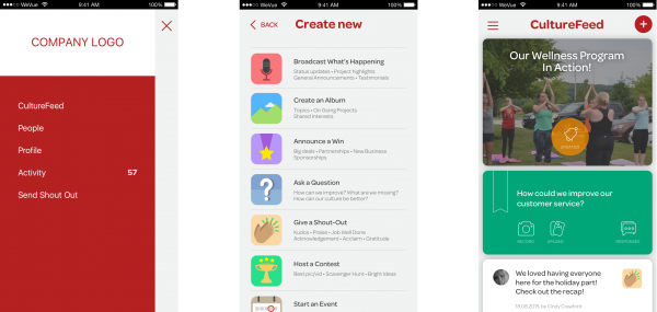
Every customer can download WeVue, and once they log in with their corporate email or a pre-approved account, the app would be branded for them. We were the first mobile product to build a a system whereby we could style nearly every element in our app from a file on a server, allowing us to spin up new, branded organizations without pushing and managing multiple apps to the store.
The “Vue”
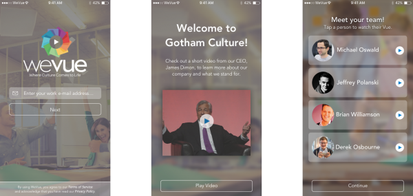
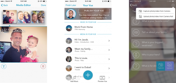
One of the more interesting pieces of technology we designed and developed was the ability to create composite videos from multiple pieces of content. We called these videos “Vues”, and through a series of tests, we eventually built out a feature where users could create “Vues” about them selves by answering a series of questions with photo and video responses, editing their answers, arranging them, and adding a soundtrack. If you’ve ever seen a new hire powerpoint, we essentially simplified that process and turned it into a feature in our app. Many companies also created Vues to recap corporate events and share them externally for recruiting.
Custom Posts
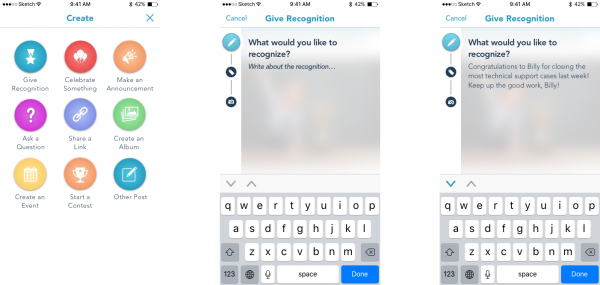
Companies could decide what types of culture content was most important to them and we would create custom post types for their teams to share that type of content. General posts included things like questions, events, and recognition. Custom posts included things like “the quote of the day”, vendor displays, and CEO or team video status updates. We also built out a prompting system, whereby we could notify specific users with push and email to add specific types of content to the app.
Admin Dashboard and Analytics
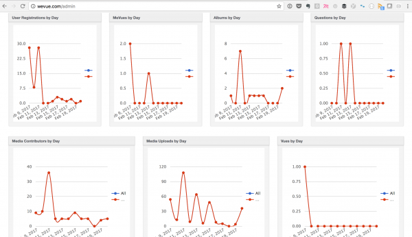
Using Active Admin, we designed and developed an internal dashboard to help theme new organizations, manage their accounts, users, and content, and to monitor activity and usage. I also helped design and implement a number of third party solutions, from SMTP email using Sendgrid to Push notifications with Urban Airship. 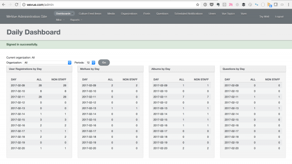
The CultureStream
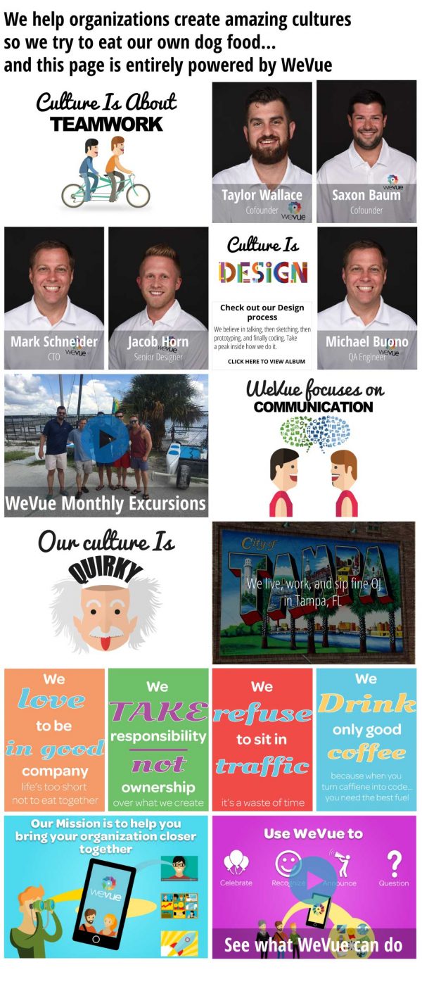
Part of our enterprise model involved allowing companies to share their culture content externally for recruiting. We built out a JavaScript widget that could easily be embedded on any internal or external website using two lines of code to showcase the content teams were capturing with the app. I learned to write JSON specifically for this project to help create these for our clients and alleviate the need for my developers to waste their time creating these for clients.
WeVue for Universities
We are currently in the process of evolving WeVue to be used for University students. I designed this deck present to University administrators and social teams for feedback before we start building new features for their specific use cases.
